CSS flex
CSS flex allows us to position elements more easily, simplifying webpage layouts using only CSS.
We could look at elements as either being a flex container or a flex item.
Flex containers
To make an element a flex container (also known as a flex wrapper), we would add display: flex in its CSS:
.flex-wrapper {
  display: flex
}
Then, we would apply it in its corresponding HTML tag:
<div class="flex-wrapper">
  <!-- this is now a flex container -->
</div>
Inline-flex
Using display: inline-flex creates a container that won't take up the full-width, so elements can exist beside the container:
.flex-inline-wpr {
  display: inline-flex
}

.non-flex-inline-wpr {
  display: inline
}
The .flex-inline-wpr would then allow any .non-flex-inline-wpr to appear beside (instead of under) the former:
<div class="flex-inline-wpr">
  <!-- this is now a flex container -->
</div>

<div class="non-flex-inline-wpr">
  <!-- this can appear beside flex-wpr instead of under -->
</div>
Items within a container using display: inline-flex would also still enjoy display: flex type properties!
Flex container properties
(In each of these properties, we must have display: flex or display: flex-inline before we use the following!)
Horizontal alignment
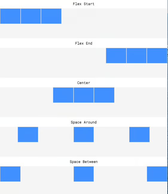
We use the justify-content property with the following values:
flex-start- child items appear at the beginning (by default, on the left)
flex-end- child items appear at the end (by default, on the right)
center- child items appear in the middle
space-around- child items appear evenly spaced out, with automatic margins on the left and the right
space-between- child items appear evenly spaced out, but with no margins on the left and the right
Vertical alignment
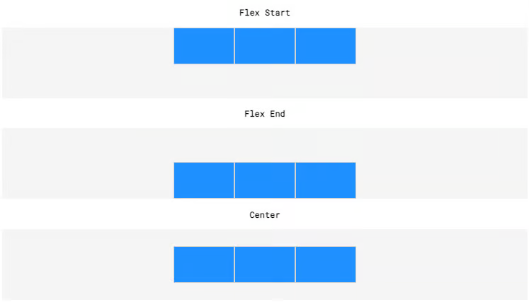
We use the align-items property with the following values:
flex-start- child items appear at the top (by default)
- flex-end
- child items appear at the bottom (by default)
center- child items appear equally between the top and the bottom
Notice how we say "by default" as rotational transformations (i.e. a flip) can also occur whereby flex-start applies to the bottom and flex-end applies to the top of the element!
Re-sizing items
The following properties have to do with the sizes of an element's child items, but they are applied in the element itself:
flex-grow- lets the items grow for large window sizes
- positive numeric value
xsets it toxtimes the default
- positive numeric value
- lets the items grow for large window sizes
flex-shrink- lets the items shrink for small window sizes
- positive numeric value
xsets it to1/xtimes the default
- positive numeric value
- lets the items shrink for small window sizes
flex-basis- lets the items grow/shrink with an absolute limit
- i.e. a positive numeric value of pixels
- lets the items grow/shrink with an absolute limit
Re-arranging items
The following properties have to do with the order of an element's child items, but they are applied in the element itself:
flex-directionrow- items are arranged from left to right, from the top left
row-reverse- items are arranged from right to left, from the top right
column- items are arranged from the top to bottom, from the top left
column-reverse- items are arranged from the bottom to top, from the bottom right
flex-wrapwrap- items are put in a new line if no space remains
wrap-reverse- items are also put in a new line, but in reverse order
nowrap- items will not wrap
flex-flow- combines the
flex-directionandflex-wrapin one property- e.g.
flex-flow: column wrap
- e.g.
- combines the